Inventory App Design
K&L Wine Merchants
Among the many UX projects I led at K&L Wines, one involved developing a new section inside K&L’s existing Retail & Inventory Team App. This app section aims to empower staff to capture, edit, and upload images of new products onto K&L Wine’s online shopping platforms. In the past, this responsibility rested solely with a staff photographer. However, the influx of new products exceeded their capacity, so the retail managers requested help from my team.
Enabling any staff member to contribute to product imagery has accelerated the work pace significantly. This increase in product imagery on their online store is a big win for K&L Wines, as bottle imagery plays a pivotal role in driving sales.
My Process
To do so, I interviewed the retail and inventory team to understand their daily behavior on the app and identified scenarios requiring the new feature. I learned that staff members could view and edit product details both in list pages and on product detail pages. It became clear that these were ideal entry points for the image upload process.
By meeting with retail managers, I also learned about additional needs such as automatic image background removal technology and guidance integrated into the workflow to train staff on how to capture successful product photos.
Based on these insights, I created written user flows and reviewed them with retail managers.
Based on these insights, I created written user flows and reviewed them with retail managers.
I also participated in engineering meetings where the background removal API was chosen, and I received functionality details to incorporate into my next round of work.
Once the retail managers and I reached consensus on my written flows, I began creating rapid visual flows and wireframes to present to the engineering team.
While presenting visual wireframe flows to the engineering team I shared multiple integration options. This allowed the team to assess LOE and choose a plan that was feasible considering their other projects and priorities.
Beyond our meetings with screen-sharing and voice chat, we used Miro for asymmetrical collaboration. Using comment bubbles, I made sure to clearly indicate which screens in the flow were pre-existing in the app and which ones were proposed as newly created pages.
I my research, I identified three major project requirements. Below are examples of my proposed solutions along with some screenshots of wireframe flows.
1. Initiate image capture from logical places in user workflow

User need: Initiate image capture from both the PLP and PDP.
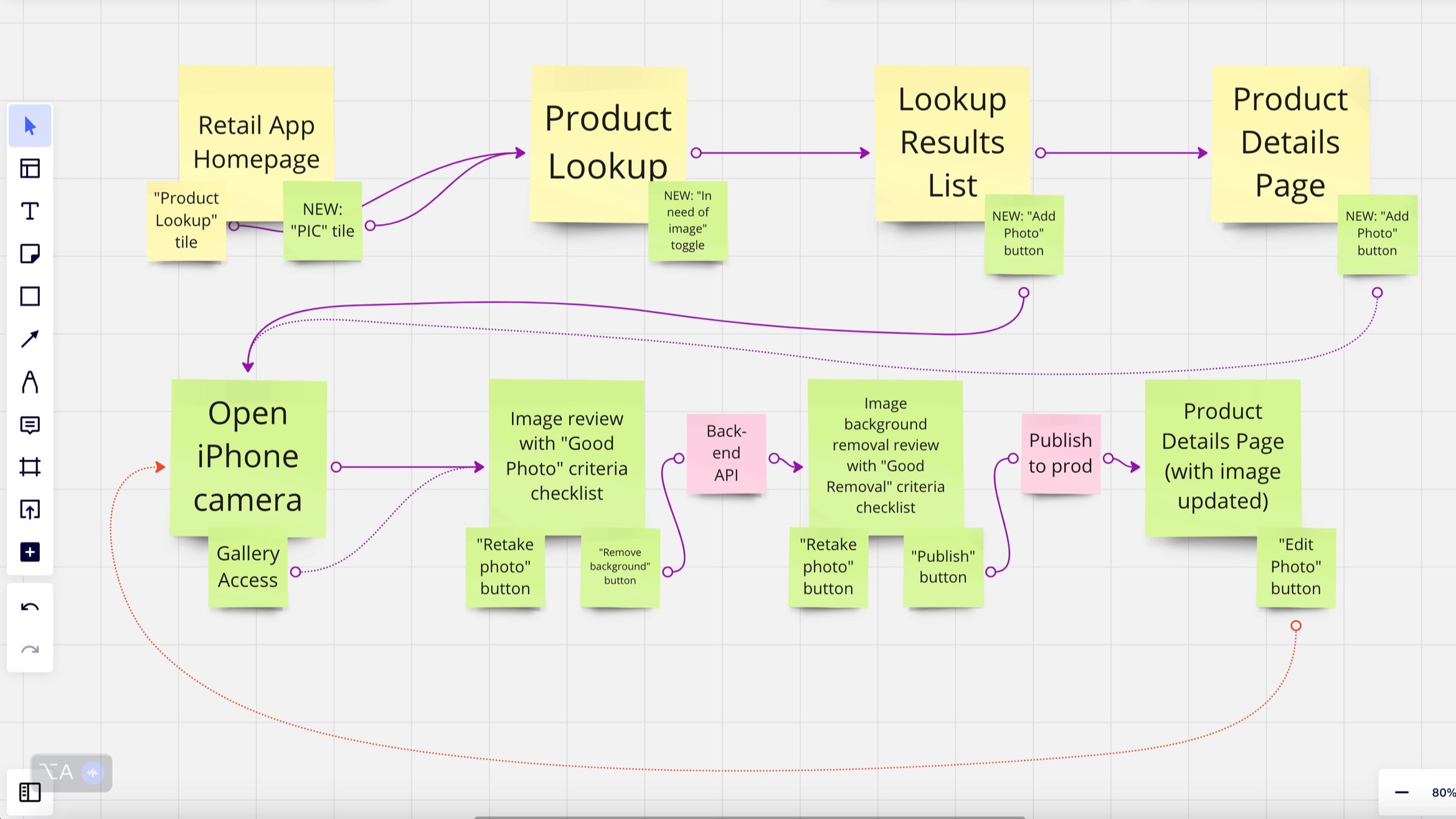
My Solution: I proposed a change to the existing PLP and PDP* to replace the "No Image Available" space with an "Add Image" button, allowing users to access the iPhone camera and gallery from within their two most common inventory workflow areas.
*Product Listing Page and Product Detail Page
2. User must preview and approve photo for quality issues before background removal is initiated.

After capturing or selecting an image, it would appear on a new page within the app. On this page, I included an “ideal image” checklist to assist users unfamiliar with common issues with product images.
To initiate the background removal process, I introduced a button labeled "Continue to Remove Background." I selected this phrasing carefully, knowing "continue" typically implies a step rather than the completion of a task. This avoids a user assuming their task is complete as soon as background removal is initiated.

3. User must confidently review background removal results and publish the image to the live consumer site.
The next page I designed was a preview of the background removal and a checklist for "good background removal." This checklist was more visual to aid those unfamiliar with the technology. On this page, I introduced the "Approve and Publish Image" button as the final step; after which the page would change back to the PDP or PLP with the updated image and a green success banner at the top.
During this part of the process, I received news from the engineering team that they had discovered an issue with the API they had planned to use to remove the image backgrounds.
The engineers learned they could only make the API work for the desktop version of the K&L Retail Team App. This meant reconsidering all the work I had done so far and getting back in touch with retail managers to learn about any new limitations this change might create for their teams.
Time to go back to the drawing board!
Not only did this change require the mobile and desktop features to interact seamlessly, it also meant splitting the workflow between two different people working at two different times.

The initial part of the mobile workflow remained unchanged, while the latter part now shifted entirely to the desktop user. This desktop user was responsible for reviewing photos post-API and publishing them to the live site.
The two most significant alterations I focused on were ensuring that mobile users had clear confirmation their photo had arrived at the desktop app and enabling desktop users to reject flawed images confident in their knowledge that the photo would be retaken.
To address these changes, I introduced an interactive "Send to Review" button on the mobile interface.

This button would turn green and display a success message once the image reached the desktop review area. This way, mobile users could confidently close the app, knowing that their work had been successfully sent to its next step.
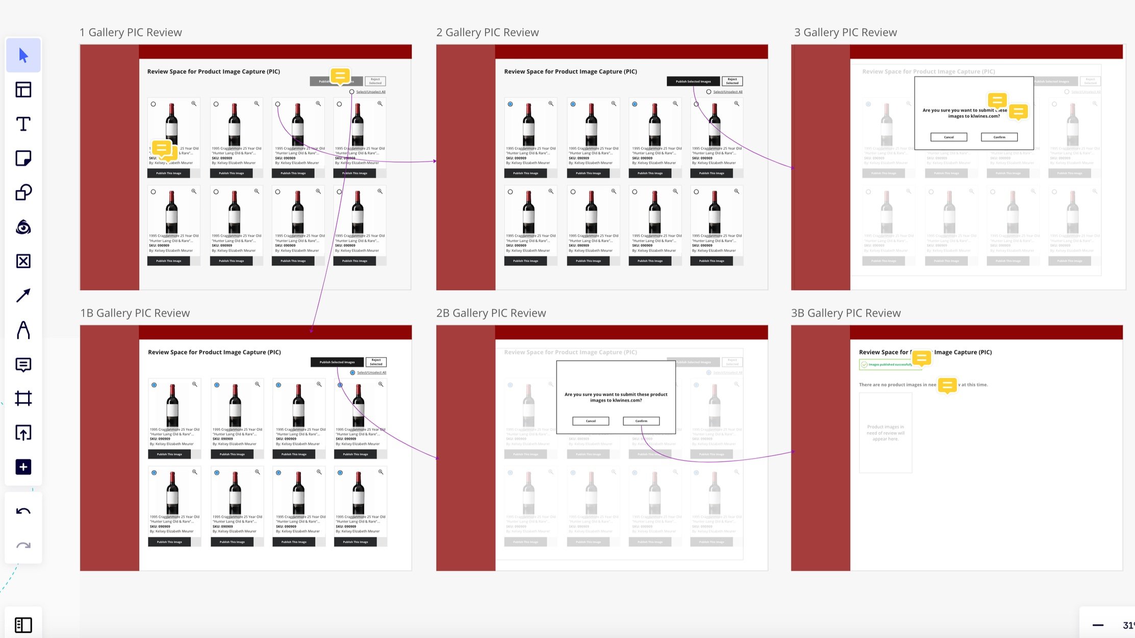
I created a product image gallery for desktop users with "publish" and "reject" buttons for individual images and batches.
If an image was rejected by a desktop user, the same mobile user would be notified on their end. This follow through kept the workflow organized.
Because the flows had undergone significant changes due to API limitations, I presented this updated work to retail managers for another round of reviews.
Once this round of work was refined by retail and engineering teams, I moved on to higher fidelity mockups to ensure that the existing app styles did not disrupt the usability of the new feature.

During this phase, I included detailed UX documentation using comment bubbles to explain any complex interactions or animations.
I transformed these screens into clickable prototypes to ensure that any interactions not easily understood from previous reviews could now be tested firsthand.
At this point, I conducted a final review and revision with both the retail managers and engineering teams to ensure alignment on the finer details. They all had the chance to use the clickable prototype, test it, and provide final feedback before I moved the project to its final step.
I provided the engineering team with final, high-fidelity screens via Sketch. Every aspect of the design was inspectable, so styling and responsiveness were clear and easily referenced.

Once the engineering team built this feature into the staging environment of the Retail Team App, the retail managers and I were able to test it and provide feedback before it was made available to the rest of the team in the live app.
I organized my feedback as Jira tickets for the engineers as this was their preferred tool of choice during dev work.
Lastly, I conducted follow up interviews with retail teams to check how the new section was fitting into their daily usage and expanded inventory goals.